


A word of advice: Don’t mess with New Yorkers’ hearts.
Change the iconic “I Heart NY” logo? Fuggedaboutit!
A loud Bronx cheer could be heard in all five boroughs as soon as this new “We Heart NYC” logo was unveiled this week, as part of a campaign designed to promote the city coming back from the COVID pandemic.
This unwelcomed change to the iconic “I Heart NY logo” has broken many a New Yorker’s own.
Who tampers with a Milton Glaser design, anyway?
I love New York. I hate the new logo.
The “I Heart NY” logo is so ubiquitous in New York that it feels hard to imagine a time it didn’t exist.
New York 1975

Craving diversity and excitement, I rushed headfirst into The Big Apple just at the time of its alleged downfall rampant with crime, arsons, and prostitution. Despite President Ford denying a struggling N.Y.C. any federal aid, in essence, telling the city to “Drop Dead, it was anything but dying to me. What others saw as a near-death experience for the city, nourished me in ways I crave. Photo Mayor Abe Beame 1975
The fact is, when I moved to the city in 1975 it didn’t.
I may have loved New York but New York City was far from lovable.
It was dangerous and dirty, and drug use was rampant. Vandalism was incessant and looking over your shoulder was a way of life. Graffiti-covered subways were overcrowded, unreliable, and filled with beggars, flashers, and chain snatchers.
A close-to-bankrupt N.Y.C. seemed beyond redemption. The media consistently showed a city plummeting. Movies like Taxi Driver, Death Wish, The French Connection, and Escape from New York, all served up a dangerous and gritty N.Y.
Even bucolic Central Park became synonymous with crime and muggings which became the punch line for too many Johnny Carson jokes about “Fun City.”

Part of “Fun City” were the countless storefronts that advertised live sex acts, X-rated 8mm films books, magazines, ,
The city had been in decline for years. After a comment in 1966 from incoming Mayor John V. Lindsey optimistically referring to N.Y. as “Fun City,” the phrase was used ironically by residents who were not impressed with the Mayor’s upbeat tone about a city that over the next four years would have a sanitation strike, teacher walkout, a crippling blackout, and financial woes.
By 1975 Fun City became Fear City.
From Fun City to Fear City

After Mayor Beame cut the police department due to the city being billions of dollars in debt the NYPD issued a pamphlet called “Welcome to Fear City: Survival Guide for Visitors to the City of N.Y.” The pamphlet was distributed in June 1975
That summer, visitors coming to the Big Apple were not greeted by a plethora of paraphernalia proclaiming I Love NY but with an ominous paper pamphlet entitled “Welcome to Fear City: A Survival Guide for Visitors to the City of New York.”
The pamphlets distributed by off-duty N.Y.C. policemen in airports, bus, and train stations, featured a hooded skull on the cover. It came with a blunt warning: “Until things change, stay away from New York City if you possibly can.”
Inside was a list of nine “guidelines” that if you were lucky might allow you to get out of the city alive, and leave with everything you came with.
The guidelines painted a nightmarish vision of New York. Visitors were advised not to venture outside of midtown Manhattan, not to take the subways under any circumstances, and not to walk outside anywhere after six in the evening.
And never even think of going to a decaying outer borough.
The pamphlet offered explicit instructions on how to navigate through the Big Apple – women were told to clutch their handbag close to their body using both hands, always hide everything in your car, engrave your possessions with special metallic pens, and never,ever trust your valuables to hotel vaults.

Vintage Guide To NYC Hotels 1972
Hotels were far from safe havens from the menacing streets.
“Hotel robberies have become virtually uncontrollable, and there have been some spectacular recent cases in which thieves have broken into hotel vaults.” Visitors should try “to avoid buildings that are not completely fireproof” and “to obtain a room that is close by the fire stairs.”
Tourists were getting scared off.
I, on the other hand, was falling in love with the city.

Before the iconic 3 letters and a red heart slogan he created, Glaser designed the iconic 1966 poster for Bob Dylan in 1966 that enduring symbol that hung in every baby boomer’s bedroom. Glaser loved NYC and helped found “New York” Magazine where he created many covers. Top Left is the Glaser poster teeing up the launch of “New York” Magazine in 1967
While visitors were petrified, I knew as an artist there was no other place I wanted to be. This was also the year I took an evening class at the School of Visual Arts before I became a full-time student.
The class was called “Design and Personality.”
The teacher Milton Glaser.
The man who would go on to design the I Love NY logo.
Coming to New Yorks’s Rescue

With tourists terrified, a near panic ensued.
Tourism was one of the city’s few remaining industries and a near-bankrupt city couldn’t afford to lose it. Something needed to be done to rescue the failing tourism businesses and counteract the dire image of the city.
Tourists had to fall in love with New York.
In 1977 William S. Doyle, Deputy Commissioner of the N.Y. State Department of Commerce hired ad agency Wells, Rich, and Greene to develop a marketing campaign for N.Y. State centering on the slogan I love New York.

Milton Glaser was recruited to design a promotional campaign for the city. After submitting one solution, Glaser had a better idea and scribbled the now-iconic “I ♥ NY” in red crayon while in a cab. It now is part of the collection in MOMA
Doyle also recruited graphic designer Milton Glaser to create a logo based on the ad campaign. Glaser first scribbled his “I Heart NY” design with a red crayon on a scrap paper riding in the back of a checker cab.
It doesn’t get more New York than that.
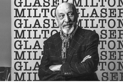
Graphic Design giant Milton Glaser
Glaser expected the campaign to last only a couple of months and did the work pro bono.
While his most-famous design’s longevity and resonance over the years surprised him, he was proud of what it accomplished.
“What the city needed at that time was an affirmation, a restoration of the feeling that New York was an important place to be,” he said in 2018.
The design was a huge success. The I Love NY logo is one of the most recognizable logos in the world and one of the most beloved.
Now New Yorkers want to know, if it ain’t broke why fix it?
© Sally Edelstein and Envisioning The American Dream, 2023. Unauthorized use and/or duplication of this material without express and written permission from this blog’s author and/or owner is strictly prohibited. Excerpts and links may be used, provided that full and clear credit is given to Sally Edelstein and Envisioning The American Dream with appropriate and specific direction to the original content.


It is hard to top Glaser, for sure. He was a graphic master, a leader in the art.
The new logo is clunky, awkward looking. The typeface used is ugly and the heart placement looks wrong to me, as if it were about to fall off a cliff.
The Glaser version has a pleasant symmetry the new one lacks, and the typeface used is sophisticated and exciting-looking, modern, “New Yorkish”!
Oddly, the extra “C” in the new one comes across as redundant. Yeah, because it is! Was there ever a doubt Milton Glaser’s “NY” meant the city, specifically? As a person who lives in the middle of the country, I saw that logo all those years ago and knew immediately it meant the city, not the state. As a university advertising student who admired Glaser’s work, the NY logo instantly came across visually as a Glaser creation, it was just that perfect!
Further, Glaser’s design was so great, it got borrowed all over the world by other cities, with their names inserted in the heart design. I doubt the new design will inspire anyone to imitate it.
LikeLike
Actually, the I Love NY logo is also a slogan and the official state song of New York State. It promotes not just the city, but the state as a whole. And this trademark is owned by the New York State Department of Economic Development. It is now most commonly associated with the city but it was used extensively to promote tourism in NY State too.
LikeLike
Perhaps the state will preserve it. I hope so.
LikeLiked by 1 person
Yes, I believe that classic logo will continue. This new one was made especially for NYC for right now. In speaking to a friend who is an art director he mentioned one f the reasons the new NYC log looks that way is because they want to be able to use it for animation and the designer had specific requirements.
LikeLike
Interesting. It’s still ugly and clunky-looking. LOL!
LikeLike
P.S. I am envious of you getting to take a class with Milton Glaser as teacher, Sally, green as a leprechaun in a grassy field in the Emerald Isle! Dang!
LikeLike
Yes, it was extraordinary. Once I became full-time student the following year the roster of teachers I had was stellar, one of the reasons I went to the School of Visual Arts.
LikeLike
And clearly honed your skills, from the collages you’ve posted and the general excellence of you blog post layouts!
LikeLiked by 1 person
Thank you. I was an illustrator for many years and then moved into the fine arts arena and began showing my work nationally. I started out as a painter and switched over to making hand-cut collages about 20 years ago.
LikeLiked by 1 person
I’ve cut and pasted myself, making little multi-page stories for friends. The smell of rubber cement may have caused a medical issue I have, though science hasn’t established the precise cause as of yet.
LikeLiked by 1 person
I hear you about rubber cement. It’s really toxic and I’ve used it for more than 2 decades. It actually is not very archival and did switch to a less toxic archival glue, but I love rubber cement. I too am experiencing some pulmonary issues and I wonder if it is connected to years of unventilated rooms with the fumes of rubber cement.
LikeLike
Yes, nothing like rubber cement for clean up of that cement that seeped outside the image edges! I like how it gave you a little time to reposition images, too, another time it was easier clean up time. I use it in an unventilated room as well.
LikeLike